RSS
Write some words about you and your blog here

Wednesday 16 December 2009

A2 Short Film January 2010 - Genie

This is our final product for our A2 coursework, a 5 minute film, of which we named "Genie." After all of the hard work and effort we put into producing this media text I'm happy with the way it looks. After projecting the final piece to an audience and watching it for the first time after post production, we received a lot of positive feedback and numerous people commented on how well our film turned out. With a huge comparison to Disney's "Aladdin" it appears that the tremendous efforts put into this has paid off and "Genie" seems to be a film that everyone has enjoyed. We managed to use and develop ideas from other films and were also able to challenge specific stereotypes and characters. It's a very touching, sweet and simple story that has been filmed in a way which arises emotions and feelings within the audience and I'm proud of the final product. If you would like to view a full evaluation of the film please direct yourself towards the labels and select any of the 'Evaluation' pages.

Please, enjoy the film!

AS Opening Sequence 2009 - Tam and Cam

Sunday 13 December 2009

Question 4 - Final Draft

4. How did you use new media technologies in the construction and research, planning and evaluation stages?

As opposed to using log books, like last year, we were introduced to http://www.blogger.com/ where we would be using blogs to display every step of our A2 coursework. This allowed us to be more creative and personal within the way that we presented our work and use of layouts and images could be included, we could relate the look of our own individual blogs to the 'world of our film.' It also created familiarity for us as students, we use the internet on a regular basis within our own time on websites such as www.facebook.com, www.myspace.com etc, so we were already accustomed to the basic settings of blogger.com. The fact that it works through the internet meant that we could access it at any time and in any place, whether it was at home or within school. This meant we had more time to do work as we weren't restricted to one location where the work could be completed. The blog's gave us the opportunity to communicate with other people, both in and out of our own groups, and provide comments and suggestions towards their work. It also meant we could access each others blogs, through our department blog - Barking Abbey Media department and see what other class mates had done that could perhaps inspire us and give ideas. The department blog was also a way of distributing our work to us as we could check it frequently and complete any work that was posted on the wall under 'Year 13'. This meant even if we were absent for any reason we wouldn't fall behind on too much work because it would be available to us on the blog. We were also using a new editing software, instead of Avid which we were familiar with from AS, we were now using Premier which was a lot better than our original software. There were different transitions and effects that we could interpret into our work and the programme was a lot easier to comprehend and I became familiar with how it worked within a few hours. The use of the new effects allowed us to create different atmospheres within our scenes, such as passing of time, change of activity etc... The digital technology we use today to edit our films allows us to use non linear editing which means we don't have to edit in the order that we film. We are able to import and upload film onto a computer and edit in which ever order we prefer so chopping shots has become a lot easier and faster.
The internet was a huge aspect of our coursework as we were regularly using it for all kinds of reasons. Due to us having blogs that were accessible to everyone via the internet we frequently accssesed them to receive feedback from other class mates. We were also able to post comments through the internet which allowed easy communication and a simple way to provide suggestions and ideas towards people's work. Through internet we were also able to use emails to contact people with information. We were able to send teachers emails informing them of any students that would be missing lessons etc, which allowed us to be time efficient, preventing us from wasting time trying to find teachers that weren't available. In the same sense we were able to email cast members with information concerning rehearsals, auditions and filming times. So technology assisted us regarding communication, it was a quick and efficient way to contact people with any neccessary information. During research and planning we used the internet to find images and clips that related to our work so it made sources of information available to us with easy accsess. If we weren't able to access the internet researching would have been a lot more time consuming and tasks would have taken longer to complete. Where we were able to simply use www.youtube.com to find videos and clips from films we would have had to actually watch films in cinemas, on dvd's etc and it would have taken us more time to do this and we would have been restricted as to where this could be done. Therefore technology provided us with simple and effective ways to complete tasks and benefitted us hugely.
Another software we used was Adobe Photoshop which I used to create the posters for our film. Although it's not professional equipment we were able to create posters of good quality that didn't look too far from real film posters. The programme allowed us to copy and paste images into the document and add effects, layers etc which improved the overall look of our posters. There was also software that could be imported through Photoshop that provided things such as new brushes that weren't available on the original programme. Therefore with a convergance of the internet and Photoshop I was able to create our film posters. As opposed to programmes such as Microsoft Paint, Adobe Photoshop provided us with the software we needed to create an imitation of a real film poster.
As well as computers we used filming equipment such as cameras and sound booms which also aided our coursework. We were already familiar with the equipment as we had previously used them in our AS course, but this year we had been introduced to new techniques and effects that we could interpret into our work. The equipment we used allowed us to have portability, the Canon camera that we used for filming doesn't require a huge crew which made moving around a lot easier which ultimately made filming quicker and more time efficient. The equipment isn't very complex to comprehend and learning the controls and buttons didn't take very long, this is because the digital revolution has made using cameras a lot easier and simple. It's also allowed people to be more creative because they don't have to be a professional camera user to be able to use one, the digital technology that we have available to us has meant that anyone can make a film and distribute it.
Due to the easy accessibility of technology we were able to do a lot of things that weren't neccessarily possible a few years ago. The internet and things such as firewire leads and usb cables enabled us to create a film, edit it and publish it on the internet for our audience to see so digital technology assisted us with the construction, marketing and distribution of our film and as students we were able to create a real short film. The technology available to us is considered universal, the technologies all converge with each other and provide new and creative ways of doing things, in relation to films it allows us to make them without the need to be a professional director or film maker.

Question 3 - Final Draft

3.What have you learnt from audience feedback?

Audience feedback has proved to be an essential part of pre-production, production itself and post production. During the initial stages of pre-production we received feedback on our pitch, which was the starting point of our films. After pitching our first ideas for a story we were informed there was a lack of logical causality, character development/motivation and there were a lot of random elements within the story. We were also told that our film needed young cast members as opposed to our original cast who were sixth formers as we were dealing with fantasy and imagination which is usually targeted at young children. There were also issues with the length of our pitch, the story was far too long and there were a lot of complications within the storyline which prevented any narrative development. However we were told that the idea of a genie was quite interesting and different and it related to our colour, gold. After listening and considering all of the feedback we were presented we realised that we were creating our story without contemplating what it will involve to make the film. We were creating a lot of work for ourselves and our story was missing essential components so we decided to approach the pitch quite differently compared to our original idea.
- We stuck to the idea of a genie as people said our story had a "fairy-tale feel" and felt almost like "Cinderella" which we thought effective. However we tried to create a simpler story and we finally agreed on the simple idea of - Boy likes girl - Genie appears and helps - He ends up falling for genie. We then built the details around this simple idea and eventually arrived at the pitch we used for the film. We minimised the cast by removing the bullies and teachers as we were told during feedback that it will become difficult trying to manage large numbers of cast. We also found younger actors to suit the target audience of our film. Since there was a lot of people informing us that there was "excessive randomness" within our story we aimed to cut this down by finding a way to bring in the gold lamp that wasn't random. This is where the idea of the poster "Aladdin rehearsals" was introduced and it was a way that allowed us to bring in the genie action to our film without it being random. We also created a relationship between Luke and Genie because feedback told us that "it's random why she decides to grant him the final wish, why does she care?". Therefore by creating a relationship we were able to create a lot of emotions and feelings within our story which then determined what the themes of our film were. This relationship also meant there was character motivation and development apparent within our film as the characters were in a different position at the end compared with the beginning. This was quite popular with the audience as they liked the fact that the two characters got together. We also changed Luke having 3 wishes to him only having 1, which meant we could cut down the length of the film and also meant we had something to base the action around - the climax of the film would be when he makes his wish. By changing the narrative, according to audience feedback, we were able to create a story with emotion and one that would have the audience emotionally engaged. Audience feedback proved to be vital as we would have created a less effective story that would have been extremely long and complicated, creating problems for us during filming with the constant setting changes, and ultimately causing a negative response from our audience.
Once we confirmed our pitch we moved on to the storyboard and script. Again, we received numerous amounts of feedback before we finally settled on our final paperwork. The storyboard was almost fine except for the important fact that it was lacking in cutaway shots. Cutaway shots are used to show the audience what is going on around the action rather than staying focused on one part of the action which would eventually become boring and long winded. This was an issue with many people's storyboard's so before we asked for feedback we went back and reviewed ours and inserted a number of cutaway shots that we thought were neccessary.
Once the storyboard was confirmed we moved on to write the script which was a very similar process to the storyboard. We were told there was "too much dialogue" and that we could tell our story through actions rather than dialogue, so we reviewed the script and attempted to cut down the dialogue as much as we could. Excessive dialogue would result in a bored audience and a lack of concentration as a lot of speech would eventually become long winded and hard to keep up with. If we had left the script as we had done it there would have been a lot more shots, to display conversations and pieces of dialogue, and this would have ulimately meant more work which meant a higher risk of rushed and poor quality filming. Therefore feedback allowed us to re-do our work so that it'll advantage us during production rather than disadvantage us, through time etc.
Once we had filmed we started editing which was a stage of post production that also required feedback. While editing scene 1 we were told that shots such as shot 4 and 5 were too long and we didn't need to see an empty frame, there was uneccessary shots that didn't need to be included as they just made the sequence too long when it needed to be more "choppy" and use quick cuts. This would prevent boredem or a loss of concentration. We also had to rearrange some of the first few shots because the opening sequence didn't look very effective as there "wasn't enough of his feet" so we took out the shot of 'Luke's' feet walking and repeated the shot of him playing the psp. We were told that our genie's appearances work very well and everyone took a liking to that part of the scene creating a good reaction within our audience. One bit of feedback we got from the first scene was that part of the body language 'Genie' does doesn't look right because it hadn't been directed properly. So unfortunately we had to reshoot a part of the first scene due to the directing at the time not being effective enough and the acting wasn't how it needed to be. Once we had done the shot again and inserted it into our sequence we received feedback that "you can't even tell it was filmed at a different time" and that it looked much better than the original shot. The second shot that we needed film during the reshoot was the shot of 'Genie' asking 'Luke' not to walk away, as we had issues with the transition from inside the building to outside. We initially ended the shot of 'Luke' turning around to 'Genie' with a black fade and then the next shot was him coming out of the door. Although we thought the fade looked okay, when we received feedback people questioned why this was there and that it was quite confusing. So during the reshoot we also took a shot of 'Genie' saying "Don't walk away!" which meant we were able to change the end of the sequence to a shot of 'Luke' walking away. So rather than make our film look bad and save time we decided to reshoot the two shots which in the end proved very beneficial to the final look of our film. Other parts of the first scene were quite confusing as it wasn't clear what was happening, feedback told us that "it doesn't appear clear enough" what we were trying to show. As we knew what was going on we assumed that the audience would also be aware but this is not the case. We realised that we were ignoring our audience and the fact that they don't know the background story or what we were showing and that we needed to make this clear to them. Without this our audience wouldn't enjoy or understand the film. The feedback from scene 2 was that we had shots that consisted of empty screens, there was no action taking place yet we showed this part of the shot. This wasn't needed and just made the film longer and created boring parts. Therefore we took these out and realised that shots like these are irrelevant, they don't move the story along or create any effect so they're not needed at all. There was also the issue that the 180 degree rule is completely disregarded within one of the shots. The camera flips completely and films from the opposite side which isn't acceptable within filming. However there were too many problems with refilming so it had to be left as it was which affected the film and made us realise that we need to be more careful and aware of filming rules while shooting. There was also a lot of background noise as we were filming in a busy part of the school but these were covered up by music and other sounds so became less noticeable. Scene 3 is the makeover scene and feedback told us that "the shots need to be choppy" and that we needed to "flip between shots of Genie and shots of Luke". This was to create a fast, choppy sequence with action reaction shots. We were also told that we needed fast, upbeat music to match the scene. We decided to go with the parallel sound because it would add to the fun, fast atmosphere of the scene. We also interpreted transitions into scene 3 which people said "added fun" to the sequence and also helped to show a pass in time.
All in all we realised that audience feedback is vital to film making because as makers of the film we don't realise that we aren't always thinking of our audience. It's easy to disregard the audiences feelings and thoughts because you forget that they don't know the basis of the story and they only know what we show/tell them. Without audience feedback we would have failed to realise this and therefore produced a less effective film.
After editing it was time to create the posters/reviews. These also required feedback for improvements and suggestions. Since the posters are the first thing that audiences see before the film they need to address the genre and ideas within the film, attracting the audience to want to watch your film. Feedback told me that I needed to "highlight the magic in the genie" and use "glitter and sparkles to reveal the magical aspects" of the film. This would help to deliver to the audience the basic ideas that are within the film, in this sense relating to characters. After hearing this I added more effects to her image which made her stand out and look more 'magical.' There were also people who suggested that on maybe one or two posters I should "reveal there is a relationship between Genie and Luke" so when creating the second and third poster I took this into consideration.
Feedback informed me of what was missing from my poster that needed to be included to sell my film effectively.

Question 2 - Final Draft

2.How effective is the combination of your main product and ancillary texts?

The film itself and ancillary texts all work together to sell and promote the film. The poster is the first of the 3 products to be released and open to the audience's eye so it has to be attractive and create a desire for the audience, to want to watch the film. Posters are used to deliver hints and clues about the genre, plot and characters of the film and to intrigue the target audience to want to watch it. Our posters reveal that our film is part of the children's fantasy genre due to the colours and characters. The colour blend of yellow and pink work to attract our main target audience of young females and the glittery effects and brushes clearly present the magical, fantasy side of our film. People said the posters were "cute" and that there is a slight "Disney feel" to them as they are very colourful and magical reflecting the imaginative and fantasy aspects that are relevant to these types of films, suggesting that our film will also be similar to the works of Walt Disney. Due to Disney being an extremely well known and established filming company it gives the impression that our film will be similar to the films that Disney produce immediately creating interest for the audience. Disney films are liked for their fantasy and family-fun stories so similar films will be intriguing for the target audience. From our posters you can notice that the film will have a theme of magic and fantasy due to the glittery backgrounds and characters. You can clearly see from the main image of 'Genie' that she is a genie due to her costume and the effects that surround her image and that perhaps she has a big role to play in the film because she is the focus of attention. She is very saturated in colour and is the main focus of the poster as she is in the foreground so her character will attract the audience as they can see straight away she is a magical character. Therefore the posters will appeal to people who enjoy fantasy/children films. Feedback informed us that it is clear to see that she is a primary character and that she has a magical touch. The prop, the gold lamp, also implies the plot will consist of genie's and magic as it is a convention of these. I was told that all 3 posters have "a clear and consistent housestyle" which helps to establish them as part of the same film. Each of them promote the fantasy and magical element of our film in their own way and through different colours and images. The saturation and colours of our posters actually match the cinematography of the film and you can clearly see a relationship between the two, displaying that they are part of the same film. This emphasises the housestyle of the posters in relation to the film and they share similarities that help to sell the film. The body language of the characters help to address the fun, childish side of the film and therefore targets the audience of children. 'Luke's' body language suggests he is looking up at the genie suggesting that perhaps they have some kind of relationship within the film. During feedback I was told that this works well and that "the picture of Luke and Genie looks cute and automatically shows they have a relationship". The genie's facial expression is looking away from 'Luke' perhaps displaying the idea that he has some kind of admiration for her because of his position in the frame and the fact that he is looking up at her. The credit block makes the poster look a lot more effective as it looks more professional and the layout isn't too crowded for it and it fits in nicely. In each of the posters there are clear indications towards the idea that 'Genie' and 'Luke' have a relationship/friendship due to their body language and facial expressions. In the second poster our audience told us that the "characters are clearly defined through the images" so our poster was effective enough to reveal the genre and provide hints and clues as to what the plot of the film is about. All 3 posters insinuate there is a relationship between 'Genie' and 'Luke' and along with the colours and fonts it suggests that the film is a kind of young love story. This will attract audiences who enjoy these films and more importantly it will appeal to our target audience of young girls.
The film review is used to provide audiences with opinions and information on what films are about and whether they are worth watching. Our film review continues to advertise our film and encourage people to watch it as it issues positive opinions and critisms of it. By suggesting it is a 'family film' it targets the audience of families. As our direct target audience of children aren't likely to read film reviews it is parents/family members that are most likely to read the review and they may be encouraged through the review to take their children/families to go and watch the film. The language of our review is quite simple and it's not very persuasive as the text is simply describing the plot of the film. However it does explain that it is a "family" film and that it is enjoyable to both "children and their parents." This would attract parents/family members to want to take their children to see it as it has been described as "fantastic" and claims that families have been watching it.
By using posters, the film and reviews you are marketing your film at various different audiences through different kinds of media. Posters are likely to be placed in areas such as bus stops, train stations, schools etc so will appeal to children/adults who use these places regularly. Reviews are usually found in magazines or on the internet so will attract attention from people who read the magazines, perhaps parents or other family members. These will all encourage people to go and watch the film because they'll be reading positive reviews of our film and be encouraged to watch our film which is 'fun for all the family.'

Question 1 - Final Draft

1. In what ways does your media product use, develop or challenge forms and conventions of real media products?

We consider our film 'Genie' to be part of the children's fantasy genre relating to film's like "Wizards of Waverly Place" and "The wizard of Oz" as well as cartoon Disney film's such as 'Peter Pan.' Many of the films which we consider comparisons to our own are infact Disney movies, the majority of them being animated as opposed to real life. This is because of the fantasy element and the target audience of children, storylines like ours are usually expressed through cartoon or animated films. However we developed the themes and fictional storylines from animated Disney films, such as "Cinderella" and "Sleeping Beauty," and brought them into a real situation that our target audience could relate to. This was done by substituting the conventional, fantasy settings such as deserts and mystical lands that are displayed in 'Peter Pan, for a more realistic setting of a school. This idea is quite similar to the one adopted in the magical film "Enchanted" where a combination of animation and real picture is used to depict fantasy into the 'real world'. This allowed us to create a new interpretation for the target audience who are able to relate directly to the film and as they are familiar with the school setting and a new experience is developed. By setting it in a school we are helping the audience to feel as though they can empathise with the characters and the situations they face, therefore keeping our target audience intriuged and entertained.
Our female protagonist 'Genie' was inspired by the all time Disney classic, 'Aladdin' and we used the idea of having a genie from this particular film. However although we retrieved the initial idea from the Disney movie, we decided to challenge the original male genie and convert him into a female. By doing this we were able to create a relationship between the genie and 'Luke' which enabled us to construct a new purpose for the genie character compared to 'Aladdin' where the two characters form a friendship.
From watching other media texts during the research stage of our coursework, for inspiration on how to dress and direct our genie, I found that many genie characters wear 'genie' trousers, indian shoes, bright colours and they usually have a headband or veil clearly illustrating them as a genie. This is apparent in our own film as she has a blue headband going across her head which is the same bright blue as her top and shoes, similar to other genie's in films and programmes. She's also a very friendly and upbeat character which can be compared to other genie's who are also usually very enthusiastic about meeting new people (such as the genie in Aladdin) and it's rare to come across a genie character who is rude and unfriendly.
By including a character who holds magical powers/ability we followed typical codes and conventions of children's fantasy as there is usually at least one character who possesses these qualities, for instance Matilda from 'Matilda' and Tinkerbell from 'Peter Pan.' Our character 'Genie' is most likely to be compared to 'Tinkerbell' or the genie from 'Aladdin' due to the powers she possesses. Female characters who are considered 'magical' are usually depicted as old or evil. The fairy godmother from 'Cinderella' and the fairy's from 'Sleeping Beauty' represent the idea of female's that hold magical powers are old. On the other hand, characters such as the evil stepmother from 'Snow White' depict the idea of these characters being evil. Our film however challenges both of these proposals as our character is neither old or evil. By having this character we were able to establish the magical, fantasy element within our story, similar to all other Disney movies.
We also used high key lighting, relating to our cinematography, which is usually used in children's fantasy along with saturated colours, to attract children and create a picture that will keep them entertained. 'Wizards of Waverly Place, The movie' also use this idea giving the film a bright, attractive look to appeal to children's eyes. 'The wizard of Oz' uses 'unseen magic' within the film therefore they never really use effects to portray acts of magic, which is an idea we applied to our film. Since we didn't have access to high end editing software or have the finance to use special effects and the like we needed to create the magic of 'Genie's' character in a creative way. We initially decided to make her unseen to anyone except 'Luke', similar to the character Fred in 'Drop dead Fred' who is invisible to everyone's eye except Elizabeth's, however due to changes in the pitch we resorted to another idea. We decided to make her magic unseen similar to 'Matilda' which didn't require effects but still gave the impression she was a magical character. For example, in the first scene she appears next to 'Luke' immediately after he has just seen her on the stairs, this creates surprise and suggests she has powers to transport herself from one location to another therefore portraying her magical character without the need for effects. In the same scene she makes a box of smarties appear and this is done in a similar way, relying on sound, camera and editing to create the illusion of her making something appear from nowhere.
The makeover scene in our film is adopted in many children's films such as 'Cinderella' and 'Aladdin,' and is used within our film to help develop our characters relationship. We chose to use the typical 'gold lamp' within our film as the genie's form of arrival but challenged the original idea of the lamp needing to be rubbed in order to release the genie. By using the initial prop of a gold lamp it creates familiarity for our target audience as they will recognize the implications that the lamp brings. As it's been used in 'Aladdin' it has become almost like an icon/convention for genie's so children will indentify the link between lamps and genies.
Our music is very similar to the arabian, mysterious sound used in 'Aladdin' as this music is normally associated with genie's and create a magical, fairy-like atmosphere which relates to the fantasy elements of these films. We also use 'Aladdin' as an allusion within our film, making reference to it in scene 1 when a poster reads 'Aladdin rehearsals.' By doing this we immediately compare our film to the Disney movie because this is how the lamp is implemented into the film, therefore it suggests the same themes are relevant to our film that are apparent within 'Aladdin.'
Although we use the idea of a genie typically appearing from a gold lamp, we chose to challenge the original concept of '3 wishes' and creating an ultimate wish which may be granted by the genie. By doing this it allowed us to have time to create a relationship between 'Genie' and 'Luke' as he only had one wish which he had to make perfectly. By developing the '3 wishes' approach we resorted against the typical codes and conventions and were able to introduce our own use of genie wishes. We created an importance of the wish and were able to make it the climax of our film - this is what the audience were waiting to hear. (What he would wish for). As we used the idea of a 'love triangle' on a children's level, such as 'Casper,' we made the audience assume he would wish for 'Olivia' but then completely disregarded this when he makes his final wish - following the pleasures of predictability.
Even though we used the typical convention of a happy ending we developed the idea of freeing the genie further to create the ending that we did. Our film challenges the codes and conventions of the genre is the way that it ends. As opposed to 'Luke' simply making his wish and having the genie leave, we decided to twist the story completely and have him fall for 'Genie' and lose his interest in 'Olivia.' This meant we kept our genie character which doesn't always happen within children's fantasy as usually the wishes are granted and the genie leaves. In 'Aladdin' he wishes for the genie's freedom as they've formed a good friendship within their experiences together. We implemented this idea within our ending but as opposed to a friendship we formed a relationship. When 'Luke' wishes for 'Genie' to no longer be a genie he ulimately takes away the fantasy of her character and makes her human, freeing her from her genie nature but in order for them two to be together. This is a different approach to 'Aladdin' who free's the genie to allow him to live his life without being a servant to anyone. We were able to develop the freedom of the genie due to the fact that we challenged the original male character with a female one.

Saturday 12 December 2009

Film review


This is the film review page featuring our film 'Genie.'

Friday 11 December 2009

Feedback from editing

After each scene had been edited we received feedback from the class on how it could be improved and anything that wasn't clear...

This meant that at each stage of editing we were aware of what needed to be changed so we were able to edit our film more efficiently


Feedback from Miss Nair - Scene 1


Feedback from students - Scene 1


Feedback - Scene 2


Feedback - Scene 3


Feedback of whole film


After the films had been edited we showcased all of them within the class and received feedback from our classmates.

Feedback on our final film:

- The titles are very good - the firework idea works well with the magical elements of our film

- The credits at the end of the film also look good

- It's a cute, young love story

- It's very touching

- It's not too soppy and it's still really funny

- The music in every scene worked well with the action taking place

- However there were some issues with sound levels - People said when the genie and Luke meet the music is very loud and over powers the dialogue slightly

- The friendship between Luke and Genie was really good and it helped to develop the story

- The 'Aladdin' theme was established well

- Everyone was very positive towards scene 3 (makeover scene) and the last scene

- The transitions in scene 3 work really well and help to show a change in time etc... and also add a fun, upbeat effect to the sequence

- The film's really cute

- The end shot is really, really good - created a good reaction - everything tied up nicely

- People liked the ending and the fact that Genie and Luke got together

- "Awww" was a common reaction


Editing Log


Editing Log:
This is the document we kept that recorded anything that was done during editing and who by and when this took place. It meant that the person who went in to use the editing software to edit the film was able to see what had been done before so they could continue from where the last person left off.

Thursday 10 December 2009

Continuity Sheets


These are some of our continuity sheets from the day of the shoot. They were used so we could write down what shot was being filmed and which take was the best, by doing this it allowed us to save time when it came to digitizing because we just simply recorded the correct shot according to what the continuity sheets said.

Wednesday 2 December 2009

The final 3 posters...


This is my final poster campaign...
The first poster I consider the main one


Poster 3 - final stage

This is the decided design of the third and final poster after receiving feedback from the class...

Tuesday 1 December 2009

Poster 3 stage 2

This is the third poster at stage 2

FEEDBACK:

- The lamp might need to be slightly bigger - it's not very noticeable
- The credit block works well on this poster
- The glitter and effects look really good and reflect the 'genie' theme
- It looks a bit like Bride and Prejudice
- It's "cute"
- Like the background - even though it's not used on every poster it still works with the background of the film
- The picture of Luke and Genie looks cute and automatically shows they have a relationship
- The blue and yellow background looks really nice and the blue compliments the colour of her top and emphasises the colour
- The 3 posters have a clear housestyle!

Poster 3

This is the third poster of our trio

This time i went for a different colour background, targeting more towards the males rather than the typical pink and yellow which would attract more girls.

Friday 27 November 2009

Film poster - Version 2

Usually film's use more than one poster to advertise and promote their film. The different posters are meant to target various audiences to the film, for example from my Rush Hour 3 task you can see the film used more than one poster to attract different people.

So for my posters I did the same thing.


This is the second version of my poster..


In order for them to look as if they're from the same film, they have to adopt some kind of 'house style' so i kept the background colour and the fonts.


FEEDBACK:


- The initial reaction from the audience was "That looks really good!"
- People said the polaroid pictures work really well and they suit the context of the film
- Keeping the pink and yellow background creates a housestyle
- The glitter works well to advertise the magical aspect of the film
- He looks like a "proper loser" - his character is defined well through the image
- You can clearly see it's a poster for the same film [as the first poster]


There were no suggestions for improvement - people immediately took a good reaction to this poster

Tuesday 24 November 2009

Friday 20 November 2009

Poster stage 3


FEEDBACK:
we got feedback from our class and they suggested these following points:

· the YGZ Productions was in the wrong place (didn't suit where it was positioned). they sugesssted that we put it at the bottom. we came to a conclusion to take it out as it wasn't really needed and it looked much better.

· they liked the sparkles, glitter and the way the smoke comes out the lamp, on the poster and found it really went well with the genre of the film.

· they suggested that we look at other posters from our genre to see what other ideas we could get for our two other posters.

· We need to think about the layout of the "U" and the names at the bottom with the credit block - play around with the postioning or just take out the names of the characters as people felt it wasn't needed and too much was going on on the page.

· to make the dull hair band stand out, why not make it glitery.

· the tagline is a bit too big why not play around with the size.

Wednesday 18 November 2009

Developmental stages of poster - Poster 1 stage 1

This is the poster so far...


I've recieved feedback today from class on the poster at the moment;
- The writing coming out of the lamp looks good and works well but it needs glitter or smoke coming out to connect it and make it look better
- There were debates on whether the genie should be as big as she is but after discussing it I was told that she should be the size she is
- There were suggestions about changing the colour of her headband and eyes...
- I was also told that Olivia shouldn't be on this poster and use this poster for just Luke and Genie
- There needs to be more glitter and stars to reflect the magical element of the film
- Maybe Luke should be in his 'geek' state otherwise it 'gives away the film' - however this was debated and it didn't give away the film exactly but some people thought it might be better to use him with glasses etc...
- Put a filter on the genie to show she is the genie (use glitter perhaps etc). She needs to be 'sparkly'.
- The font is effective and it's the right font for the poster

Monday 9 November 2009

Rough sketches - Film poster

I created some ideas for our film poster based on the discussion we had in class where other students gave us things to take into consideration.


In this poster I took the idea about having poloroids with Luke in the centre of the frame, looking clueless, with a purple background - which was one of the ideas put forward. I used the idea of having the title coming out of the lamp to reflect the magic element and to include the lamp in the poster which is quite important to our film


Thursday 5 November 2009

Film poster discussions...

Within our groups we were asked to discuss what we plan to do for our film poster...
However we weren't asked to think about who we wanted on the poster or what objects or colours we wanted to include, we were told to consider what themes our film had, feelings we wanted to express and the messages behind it all. So we brainstormed our ideas...


Themes
- love
- friendship
- magic
- fantasy

Feelings and emotions we wanted our poster express
- Uplifting
- Easy on the mind
- A young love story
- 'Brightens up the day'
- "Awww"
- Happy film
- Simplistic to an extent - target audience of youngsters

Messages
- You don't always get what you think you want
- Be careful what you wish for
- Make your choices wisely
- You can be whoever you want to be


Thursday 5th November - Class discussions

Today we presented our ideas to our class who then gave us feedback on how they pictured our poster and what we could include. Considering they are our audience it was essential that we got their opinions because we need to give them what THEY want. So as each group explained what they wanted their poster to show or express everyone else closed their eyes and imagined the poster in their own way, then afterwards they fed back to the group.
So for our poster we told them what we were trying to achieve and these are the ideas they imagined....

Monday 2 November 2009

More research of Film posters....

We were asked to chose a film that we liked and find 3 different posters for it...
Although all of these posters are advertising the same film they all have their own unique way of promoting it...

RUSH HOUR 3


- This poster for Rush Hour 3 contains quite 'firey' colours such as red, yellow, black and they're quite bold colours which each have different connotations. Red can be a colour of violence and warefare which is relevant to the film which is action based and contains many violent scenes. The yellow/orange emphasises this idea with a blend that brings fire imagery. The colours suggest the film will contain action and anger which will help to promote the film to its target audience, people who enjoy action films will be attracted to the engaging colours of the poster.
- Within the background of the poster you can notice there is an image of the Eiffel Tower which will reveal the film is probably set in Paris/France and this will help to promote the film because fans of Rush Hour will have seen the previous films and to see the film in a new country will attract the audience as they'll be intrigued to watch the characters in new surroundings and what they will 'get up to' in an unfamiliar place. The poster also has quite a few images in the poster and the background and foreground appear quite busy which reflects the idea of rush hour and suggests to the audience that it will be 'packed' full of action, appealing to those who enjoy action movies etc...
- The two men on the poster are the main characters of the Rush Hour films, Chris Tucker and Jakie Chan who are also part of the promotion of the film. They are two very well known and admired actors, not only famous for Rush Hour but for other films, which makes the film appealing to various audiences. Fans of Jakie Chan, who is famous for his fighting within films, will be attracted by the poster to see he is starring in the film so they may want to see the movie. Chris Tucker is known for his comedy roles and the fact that he always has audiences laughing so he will also appeal to his own audience and both the actors will bring their own fanbase to the cinemas etc to watch Rush Hour 3. The fact that the film is a sequel to see the famous partners 'Lee & Carter' together again will attract the Rush Hour fans and they will be likely to watch the film because they have seen and enjoyed the previous ones.
- The body language of Jackie Chan, again suggests action as he is kicking the 'frame' and glass is shattering, but it also promises the audience action and fighting (gratifications). This also grabs the audience attention because it looks as if the glass is shattering off the page which brings attention to Jackie's foot and his stance and the fact that both men are in a fighting postition.
- The tagline : "PREPARE FOR THEIR FINEST HOUR" is clever because it refers to part of the film title within it and it creates anticipation for the audience because it is referred to as their 'finest' hour so suggests this film will top the other two which will make the audience want to see it if they've enjoyed the first two.
- The font of the poster 'RUSH HOUR 3' and the actors names reflect the title as it seems if they were moving images they would be rushing across the screen, mirroring the idea of 'rush hour'. It also complements the action genre as the font is also full of 'action'.
- I think the poster suggests the target audience would be ages 17+ because almost any age can enjoy action comedies and there isn't necessarily a specific gender for the film although the fighting would generally attract boys and men but i wouldn't restrict the audience to just males
- The message of the poster is visual as the image of the two detectives and the breaking glass is what gives the message


- The information on the poster is important because it's what the audience will see before the film is released so it has to grab their attention and intrigue them in order to promote the film, so the poster is a very important part of the marketing campaign. It's likely to be placed near cinemas, on bus stops, the side of buses etc... as these are places the target audience is likely to be. Teenagers and adults use public transport so the poster will be open to their attention and introduce them to the film.


- I think it is an effective poster because it delivers the message quite well, it tells the audience almost straight away that it is full of action and the breaking glass works well with the actors body language to create an adrenaline for the audience and an anticipation to watch the movie. The detectives are looking at the camera which helps the poster to communicate with the audience as it is like they're 'inviting' them to come along with them on another quest.


- This is the second poster i found for Rush Hour 3 and it is very different in comparison to the first one. This one still has the same colours, red and yellow, but the background is white which has a different effect compared to the first poster which was a lot more colourful and crowded. However the poster appears more spacious and this allowed them use a different approach with this poster. The colours give a less of a action packed effect and reflects the comedy side more which appeals to fans of comedies and also existing fans of Rush Hour.
- The poster only contains 3 images, each of the duo Jackie and Chris, which remind the audience of the two previous films before revealing it is advertising the third film. However as opposed to the action side of the film, portrayed in the first poster through the body language, glass etc, it suggests the comedy side as they're in more 'clownish' positions and it brings about laughter for the audience which will appeal to people who enjoy comedies aswell as exisiting fans of Rush Hour who are aware of the humour within the films. The fact that the poster includes the numbers 1 and 2 before 3 reminds the audience that these characters and the film have been seen before which appeals to people because they feel they've seen the first two so they should see the third and final one.
- Again the poster promises the audience comedy and humour as the characters reflect this part of the film (gratifications)
- I think it is an effective poster but in a different way to the first one. The first poster gave away the action side and fighting aspects of the film whereas this poster focuses more on the humour so they appeal in different ways. However i feel the first poster is MORE effective than this one because there is a lot of space which may appear 'boring' to certain people who aren't aware of the nature of Rush Hour films unlike the first poster that made use of all space and delivered the message well.


- This version of the Rush Hour 3 poster is very similar to the first one. It contains the same colours, fonts, background images but the breaking glass and foot are absent. This also creates a different effect but is still appealing to the audience. Even though the kicking foot isn't there you still notice their body language, they're fists clenched and defensive so the audience are aware that the film contains fighting/violence, attracting people who enjoy these movies.
- The same 2 characters are in the centre of the frame, again, attracting fans of the actors who are familiar with their work and the types of films they work in, and this particular duo act as a USP for the movie.

Friday 30 October 2009

Film poster research

In order to create our own poster i thought it would be a good idea to research existing posters to get ideas that could contribute towards our own one. I looked at films relating to ours aswell as a more general selection...


MATILDA - can be considered similar to our film as it has a target audience of children, it involves 'magic' and it's "fun".
The poster uses bright colours, with a main colour of yellow, which immediately establishes it as a childrens film because of the use of primary colours. The primary image consists of the main characters and their personalities are suggested through their body language and position in the frame.


THE WIZARDS OF WAVERLY PLACE - the poster for Wizards of Waverly Place can also provide ideas for us because the film is again, similar to ours. The theme of magic is relevant within this movie and this is apparent in the poster due to their wands and the glow of them. Again, the main characters are in the poster and their body language suggests subtle characteristics, for instance the centre female, Alex, looks slightly mischevious due to her facial expression.


THE WORST WITCH - this is another film involving magic and witches, relating to our film because of the 'magical' element. This poster has a bit more colour in it with the purple background which may be something we need to include in our poster because we need it to look attractive and appeal to a young target audience. The image contains the main characters and the costumes and setting illustrate what the film is about.


HARRY POTTER - this is another film that we can relate to, and the poster may also inspire us for our own one. The poster is a lot more crowded than the other ones and there are images all over the page but this is to show a variety of characters. This isn't relevant to our film as

we only have 3 characters so it would be hard to do this, however we can use other moments from our film for

images but this will be something we discuss when

creating the poster.

Tuesday 20 October 2009

Friday 16th October 2009 - 3rd day of shooting


Well today was the third and final day of shooting that i took on by myself. Miss Bundy had lessons to teach and anyone else was busy at the start of the day so i took the first few shots without any assistance. Towards the end of the day i recieved help from one of my friends Rosie Kaur who helped me to bring the filming to an end.
I managed to finish scene 1 and refilm some of scene 2 as well as finish it off, even though it was difficult handling all 4 roles we packed up the camera by lunchtime so spent 4 hours filming on the extra day.

I am extremely grateful for everyone who helped me and very appreciative of my cast who were patient and cooperative. :)

Thursday 15 October 2009

Thursday 15th October 2009 - 2nd day of shooting!

Well, i thought yesterday was stressful, today was an even more tense and tiring day for me.
There was an issue that took place which resulted with my two crew members having to leave the shoot for the day and i was left with sound, continuity, camera and directing. It seemed impossible at first but i was determined to continue, I didn't want to pack up and dismiss cast which was suggested by my teacher. Miss Bundy came to help me and her and I took on the 4 roles between us and managed to get almost all of the shots done.

Today we managed to film all of scene 3 and all of scene 4.

We got around 30 shots from scene 1 done and the remaining shots will be completed tomorrow.

We didn't manage to get everything needed done so tomorrow will be another day of filming but we should cover all the necessary shots within 3 lessons.
The cast's teachers have been informed and so have mine so no one will recieve absent marks.

Wednesday 14 October 2009

Wednesday 14th October 2009 - 1st day of shooting

Today was our first day of filming and... it was extremely stressful. There were so many problems that occured and interupted our filming, many of them were out of our control.

After we did our equipment checks and all of the cast arrived we set off to start our filming.

Intially we had a time schedule that was arranged during pre-production:

LOCATION NEEDED. TIME. CAST + YEAR GROUP. DAY

Media hallway and Start: 7.30 Dilpreet, Zahrah & Liam Wednesday
the media doors End: 12am Year 10


Maths Quad Start: 13:40 Dilpreet, Zahrah & Liam Wednesday
End: 5pm Year 10


Drama room 1 Start: 7.30 Zahrah, Extras, Dilpreet Thursday
End: 10.35 & Liam
Year 10


Green room Start: 11am Dilpreet & Liam Thursday
End: 1pm Year 10


History Hallway Start: 1.40pm Dilpreet, Zahrah, Extras Thursday
End: 4pm & Liam


Media classroom Start: 4.15pm Dilpreet & Liam Thursday
+ hallway End: 5pm Year 10


We organised our shooting in a way, we thought, would work best according to the times we booked specific rooms etc...

However things didn't go exactly according to plan and shots planned for Wednesday couldn't be done and we didn't want extra work for Thursday as there was already more than enough to do.

Problem 1 - The drama room we planned to use in the morning was locked and there were no drama teachers available to open it for us so we had to prospone quite a few shots - for later in the day.

Problem 2 - There was too much noise from music rooms and practise rooms that interfered with our film and were blatantly noticeable through the sound equipment. Therefore we chose to move to location 2, Maths quad, and come back to all the shots in the media hallway/doors later.
Also, because we hadn't printed of the Aladdin Rehearsals poster we couldn't do the shots outside the media doors and we had decided to reschedule them for Thursday, not knowing the other issues would also arise.

Problem 3 - The maths quad proved to be a very hard place to film, with many students and teachers walking through and classes making a lot of noise. The school's charity Fashion Show rehearsals were also taking place in the hall which is centered inbetween the quads and the music and noise also made it impossible to film. So now there are a few shots that still need to be filmed tomorrow.

Problem 4 - When we went back after school to start on our shots in the media hallway and drama room, there were more obstructions to our fillming. There were music groups rehearsing & drama rehearsals which made both of our planned locations unavailable. Both parties were leaving within the hour but it meant us and the cast waiting around doing nothing for an hour. We couldn't start on some of tomorrows shots because cast didn't have required costume and we didn't have access to the needed settings so we were confused and stressed deciding what to do.


Brainwave...
After a while i though we could perhaps begin on Scene 5, the scene where Genie has become a student and she comes to class where Luke is. When rehearsing the scenes through the camera we thought it didn't 'flow' and it seemed very stupid without extras to make it look like a classroom scene. So we changed our storyboard slightly and instead of the genie coming in to the class and sitting down she is simply meeting Luke from class and he is packing his things away and they leave together. We changed our closing shot to a close up of them holding hands which proved extremely effective.


Now we just hope tomorrow gives us enough time to take the rest of our shots ! Ahhh

Tuesday 13 October 2009

Photo storyboard

After producing a hand drawn storyboard the next step in creating a film is to make a photo storyboard. This involves taking cast out to locations and taking still images of the shots that will be filmed, just like the original story board but this time with a digital camera.


Our photo storyboard:


We used Zak in some shots as Liam Fitt (Luke) was absent from school the day we needed to do the storyboard. We also had 2 other students to play Genie & Luke as we again, weren't able to meet up with the real cast.

Our cast

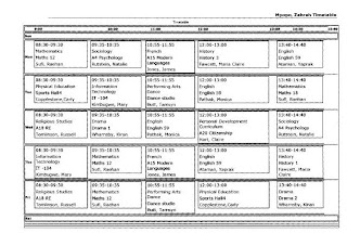
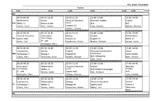
We've got our cast's timetable so we are aware of where they'll be if we need to contact them about rehearsals or filming details and also so we can inform all of their subject teachers of their absence.


Zahrah Mpopo's timetable ("Olivia")

Dilpreet Taak's timetable ("Genie")


Liam Fitt's timetable ("Luke")

Directors Masterclass


Before we went off to do our filming each member of the group attended a masterclass specifically designed to the role they would be undertaking.
So for me I went to a masterclass concerning directing.
I recieved a lot of information about how cast should be handled and the best way to direct...

What to do with your cast as a director...
The director should really be the only one talking to the cast, they need to form a special relationship


Getting into character:
- Explain the character to help get them into role
- Introduce them to the character profiles - give them the background to the person they'll be playing
- Don't give them a stereotype of character such as "Your character is really bitchy" as it may affect their acting


In rehearsals:
- Clearly explain what they need to do
- Take them to locations
- And maybe explain to them how a film is made - inform them of the various steps included so they understand that it's not easy or simple and will require patience
- Rehearse in order of the shooting schedule
- Show them the storyboard and shooting schedule


During shoot:
- Remember to tell them there must be silence on set
- Let them be aware that there's a lot of standing around and waiting
- Introduce the crew
- Show them the equipment
- Look at what is happening on the camera screen NOT the live action - it's what the camera see's that will be shown to the audience
- Explain to the cast that they must do the whole sequence during every shot
- Tell cast NOT TO LOOK AT THE CAMERA AFTER FILMING A SHOT
- And that they must NOT ACT UNTIL I SAY "ACTION" OR STOP UNTIL I SHOUT "CUT"

Health & Safety

We recieved a health and safety talk from Mr Edwards, one of the deputy heads of Barking Abbey, who spoke to us about what is expected of us when we're working around the school and safety hazards we should be aware of.

- He told us that last year, the filming caused a lot of grief around the school - we have to remember to be sympathetic to other teachers and students because the rest of the school is still in action

- We have to be aware of where we leave equipment - whether it's going to be an obstruction or if there's a risk of it getting stolen - last year there were cameras left laying around

- We also have to remember that equipment needs to be packed away 10 minutes before any bells go, making sure we don't get in other students way and prevent it from getting damaged

- We have to be concious of people if we are outside the school building - there are caretakers, drivers and other various people coming through the school and we need to make sure we aren't blocking any entrances or exits. This also being a safety hazard

- After school we need to make sure there isn't anyone outside of school on the premises because we don't need distractions, there are homework clubs in action so we have to take that into consideration aswell